
Revamp Profits
Transformation for new generation investor
- Company
- Phintraco Consulting
- Platform
- Mobile app
- Year
- 2026
The Beginning
Profits Anywhere was built as a serious trading tool. Order Book, Running Trade, Broker Meter, Shares Pivot: the app carried the instruments that active traders ask for, all in one place.
But the people holding the phone were changing. More and more of them were young, many of them Gen Z, opening a trading app for the first time. They arrived with expectations shaped by the apps they use every day: clear, quick, and good to look at.
And the first thing they met was a screen called Market. It was not really about the market at all.
We saw a mismatch
What if the homepage could start with the market, instead of a menu?
Three things stood in the way. They are also the three reasons this revamp happened.
It looked like it was made for someone else.
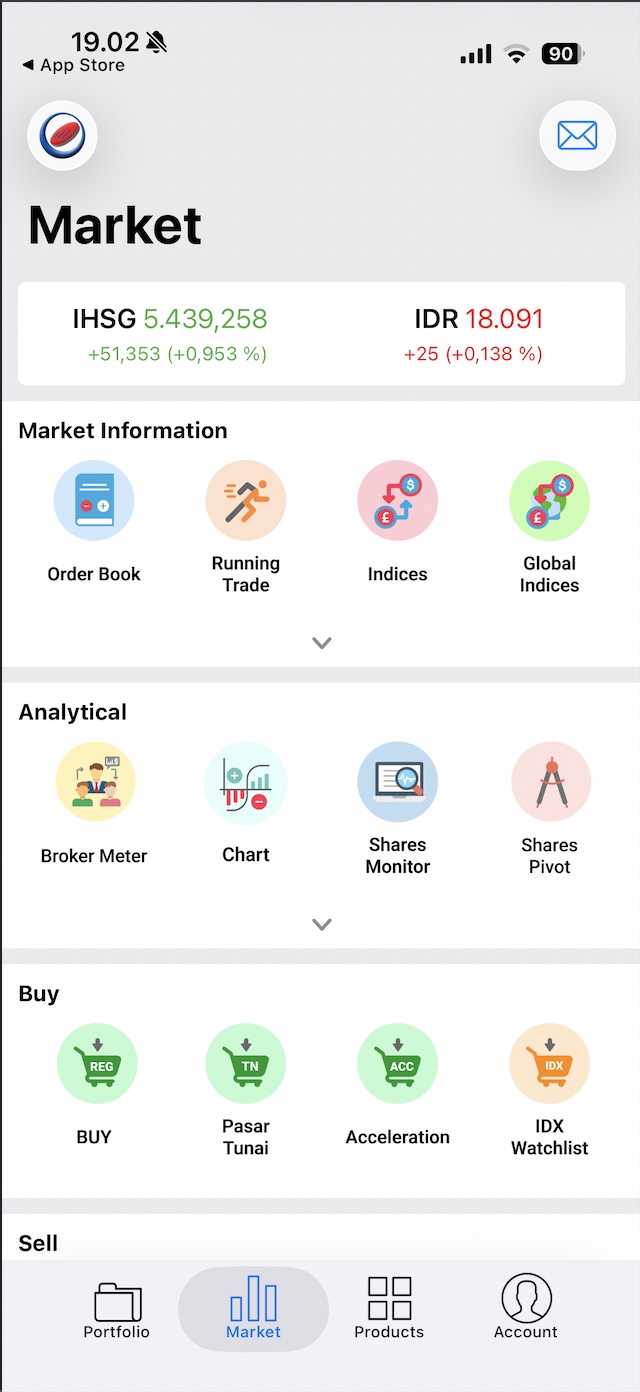
Pastel clip-art icons in coloured circles, a heavy page title, flat white cards on grey. Each piece made sense alone, but together they felt like an app from another era.
For a young investor deciding whether to trust a product with their money, that first impression matters. The product had grown up. Its audience had moved on.
Everything spoke at the same volume.
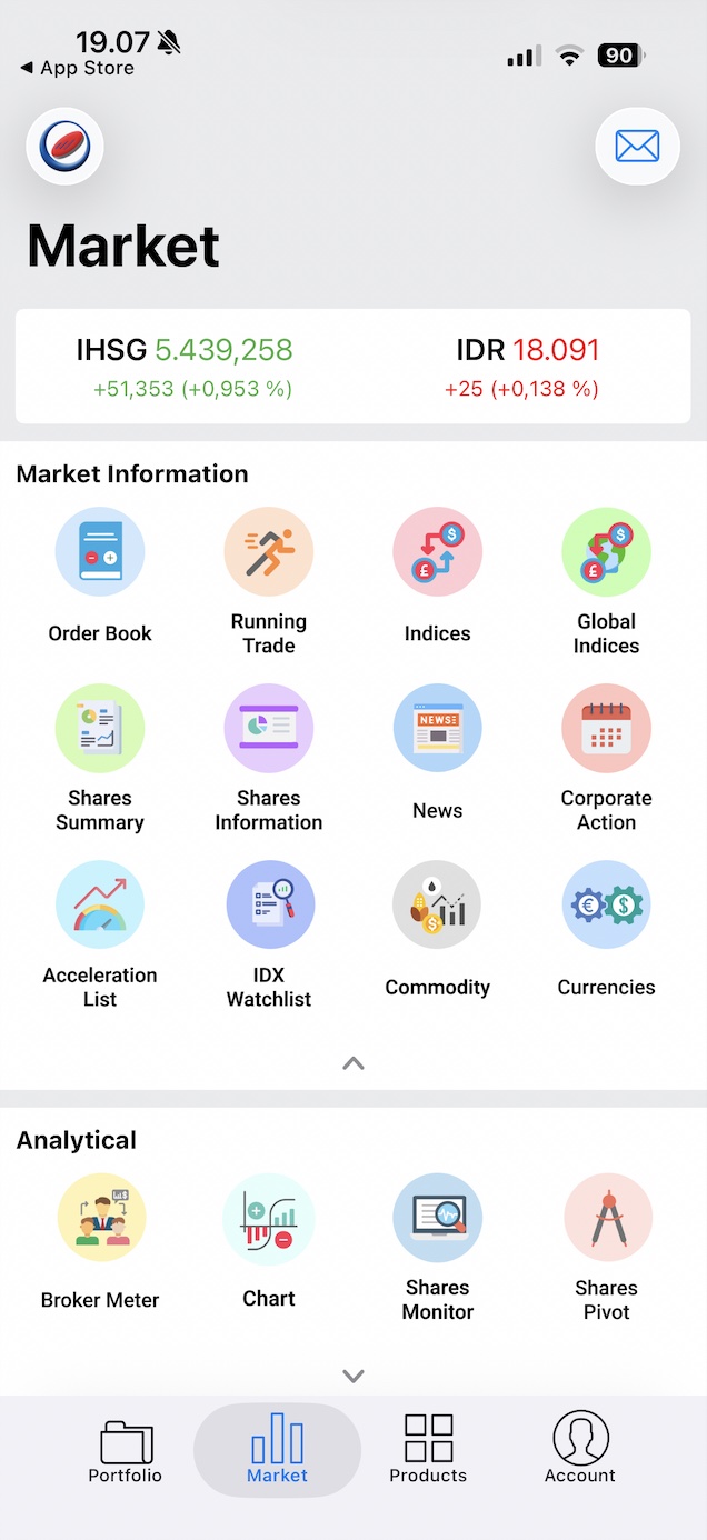
Three sections, twelve icons and one small index card, all at the same size and weight. Nothing said “look here first”. Nothing special here.
The only real market data gave a number but no story: no trend, no timeline.
There was no journey, only one action at a time.
A good app lets people wander, try things and slowly feel at home. That path is the journey.
The old homepage was a list of doors: pick one, do one thing, come back. Features sat behind chevrons, with nothing to browse.
People could not explore, so they could not get familiar on their own.
So before drawing anything, the question became
What is a homepage for?
The Journey
The solution
We stopped asking which feature goes where, and asked what a trader wants to know in the first three seconds: where do I stand, how is the market, and what can I do about it? The new homepage answers those three, in that order.
The unique value
Pro-grade market depth, made glanceable.
Profits carries the depth serious traders value. We did not add more. We made it easy to read, so a new investor can start the day here with confidence and a seasoned trader still finds everything.

A new face
A dark, confident look with one icon family and clear colour rules: green and red for price, blue for “tap me”.
A shorter path
Buy Sell sits in Quick Access, one tap away. Movers and ideas lead straight to a stock, and Deposit lives on the asset card.
A clear order
Pulse first, then act, then explore. Size, colour and space follow that order, so the eye knows where to go.
On screen
Here is that idea on the real homepage. Scroll the phone, or pick a question.
- PulseHow you and the market are doing right now.
- ActWhat you can do about it next.
- ExploreWhat else is worth a look.
Before and after, side by side
Watch the first screen change from the old homepage to the revamp. Pause to hold either one, or drag to compare.
The Design
Every journey below plays by itself, straight from the final screens. When one journey ends, the next begins. Pick a journey to watch it, pause to look closer, or jump to any step.
The Ending
In the end, the homepage stopped being a table of contents and became a briefing.
A trader opening Profits now sees where they stand, how the market is moving and what they can do about it, before tapping anything. The look says this product was made for today’s investor. The path to a trade is shorter. And the most important thing on the screen is, finally, the most important thing.
Before the revamp
After the revamp
The people changed
An app that looked built for someone else
→
A product that looks built for them
The information
Twelve icons, all at the same volume
→
Pulse, then action, then exploration
The journey
One action at a time, with no room to explore
→
A homepage you can wander, with action one tap away
A homepage is not a table of contents. It is the answer to the question the user walked in with.