
Revamp Buy & Sell
From a loose form to an order you can place with confidence
- Company
- Phintraco Consulting
- Platform
- Mobile app
- Project
- Profits
- Year
- 2026
The Beginning
Buy & Sell is where a decision becomes money. After reading a stock, the investor has to turn it into an order, and they ask three things: am I buying the right stock, what can I afford, and what happens after I tap?
This revamp goes beyond a new look. We rethought the flow’s structure, visual hierarchy and layout, and the design decisions behind them, so one page answers those questions in that order, from placing an order to amending or withdrawing it.
We started by holding the old order form up against the same rules as the rest of the app, and looking at what got in the way.
An order page has one job
Let me place the order I mean, without second-guessing.
Measured against that job, three things stood in the way. They are also the three reasons this revamp happened.
The stock was a field to fill in.
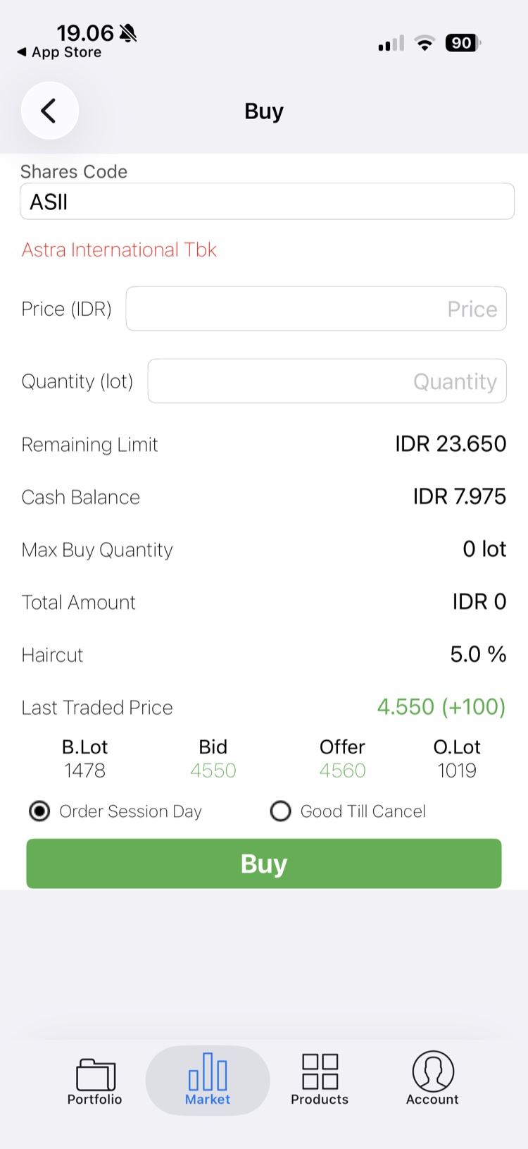
The page opened on Shares Code, a plain text field, with the company name beneath it in small red text. There was no price and no change, so nothing showed what the investor was about to trade.
Buy and Sell were separate screens, so switching sides meant leaving the page. The first thing on the page was a label, not the stock.
Numbers with no order of importance.
Remaining Limit, Cash Balance, Max Buy Quantity, Total Amount, Haircut and Last Traded Price ran down the page in the same size and weight. Haircut sat between the total and the price, though it relates to neither.
The investor had to work out for themselves which number set their limit. Nothing said which one mattered most, or how it changed as they typed.
The action floated in the middle.
The Buy button sat directly under the order-session choice, in the middle of the screen, with an empty grey area below it. Bid, Offer and lots were squeezed in just above, without an order book to explain them.
Where the button landed depended on the content, so it was never in the same place twice. The most important action had no fixed home.
So before drawing anything, the question became
What should an order page keep in front of you?
The Journey
The solution
We built the page around the order of the investor’s decisions: which side, which stock, how much, then confirm. Everything for one order now sits on one page, the stock is a card with its price, and the action lives in a fixed bar at the bottom.
The unique value
Everything for one order on one page, and a total that updates as you type.
Side and stock first
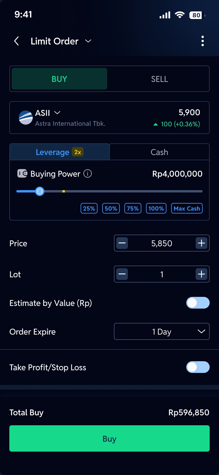
A Buy / Sell switch sits at the top, so changing sides takes one tap. Under it, the stock is a card with its logo, name, price and change. The page shows what you are trading before it asks how much.
One number for your limit
Six figures became Buying Power, with a slider and shortcuts at 25%, 50%, 75%, 100% and Max Cash. Leverage and Cash are two tabs, and an info icon explains each one.
A fixed place to act
The Total and the Buy button are pinned to the bottom, always in the same spot. The total updates with every change to price or lot, so the number you confirm is the number you saw.
Beyond the first screen
With a clearer base, the rest of the flow could be reorganised too. Each of these is designed as its own journey.
- 01
Price and lot with steppers
Minus and plus buttons step the price by a tick and the lot by one, so most orders need no keyboard.
- 02
Estimate by value
Know the amount, not the lots? Switch on Estimate by Value, enter the rupiah, and the lots are calculated for you.
- 03
Take profit and stop loss
Set both exits at the same time as the order, with the extra fields tucked behind a switch until you need them.
- 04
Order types in one menu
Tap the title to choose Limit, Cash Market and more. The page adapts to the type, and rights stocks switch to Cash Market on their own.
- 05
Stocks in a sheet
Change the stock without leaving the page, by searching or picking from a short list with price and change.
- 06
Warnings that explain
An insufficient balance, a wrong lot or a stock you do not hold each get a plain message that says what to change.
- 07
The order queue
Open orders sit below the form with their status, and can be filtered by price or by state.
- 08
Amend and withdraw
An order that is still open can be changed or taken back from its detail page, after one confirmation.
Before and after, side by side
Watch the order page change from the old Buy form to the revamp. Pause to hold either one, or drag to compare.
The Design
Every journey below plays by itself, straight from the final screens. When one journey ends, the next begins. Pick a journey to watch it, pause to look closer, or jump to any step.
The Ending
In the end, Buy & Sell stopped being a form and became a confident last step.
An investor placing an order now sees which stock it is, how much they can use and what the total will be before they tap, and the same page carries them on to the queue, to amending and to withdrawing.
Before the revamp
After the revamp
The stock
A text field and a red name
→
A card with logo, price and change
The numbers
Six rows of equal weight
→
Buying Power, a slider and a live total
The action
A button wherever the content ended
→
A fixed bar with the total and Buy
An order page is not a form to fill in. It is the last moment to be sure.